Supermarket Brand
Design
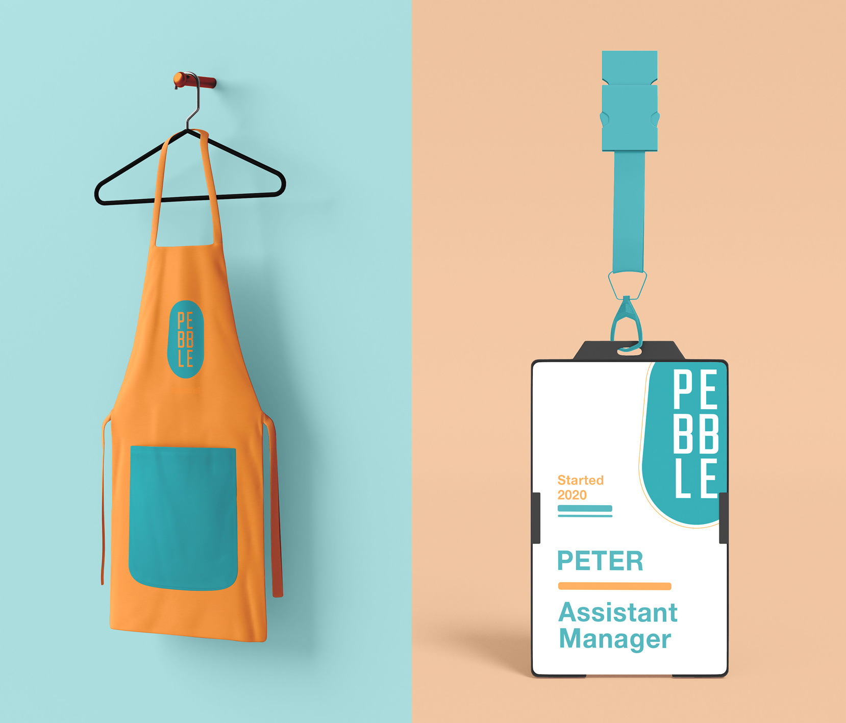
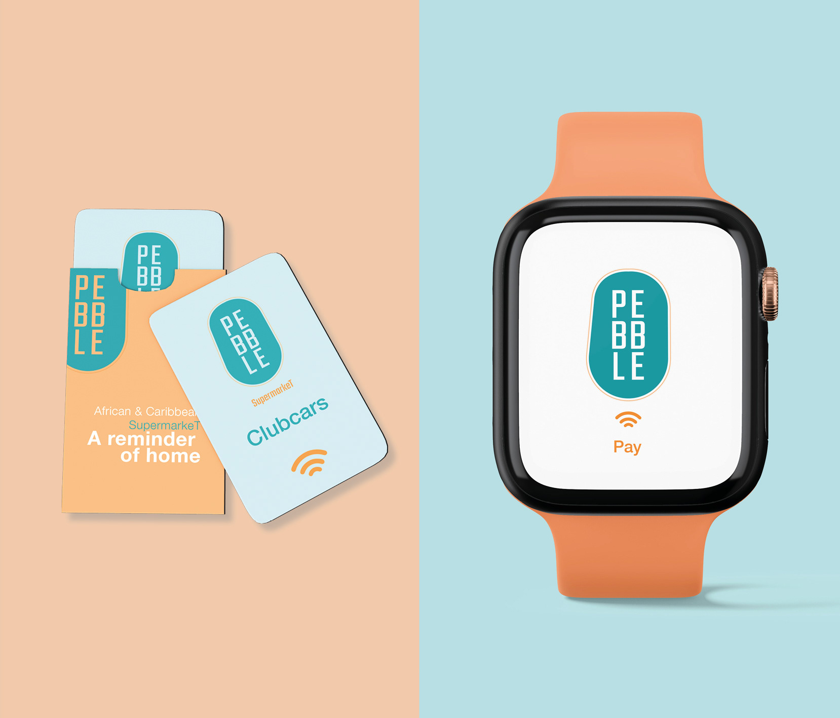
This is a personal project with the projection of creating a concept design for an African-Caribbean supermarket brand. I wanted the logo and name to be both visually friendly and inviting. After researching other logos and brands, I decided to name my conceptual company ‘Pebble’.
Inspiration for the brand identity.
I was influenced by the visual appeal of Japanese lanterns, but ultimately settled on a slightly off-set design to replicate a natural pebble. The typeface I selected features letterforms with low stroke contrast and square proportions with a structure that appears visually simplistic.
Why I did this Project.
The aim of this design was to change the general perception of African-Caribbean supermarkets in the western world. I wanted to show that they are a welcoming and safe place for everyone; a place where people can meet and learn about different cultures and traditions whilst providing Customers with high-quality products from Africa and the Caribbean.
