Rebranding Project
Brand Design
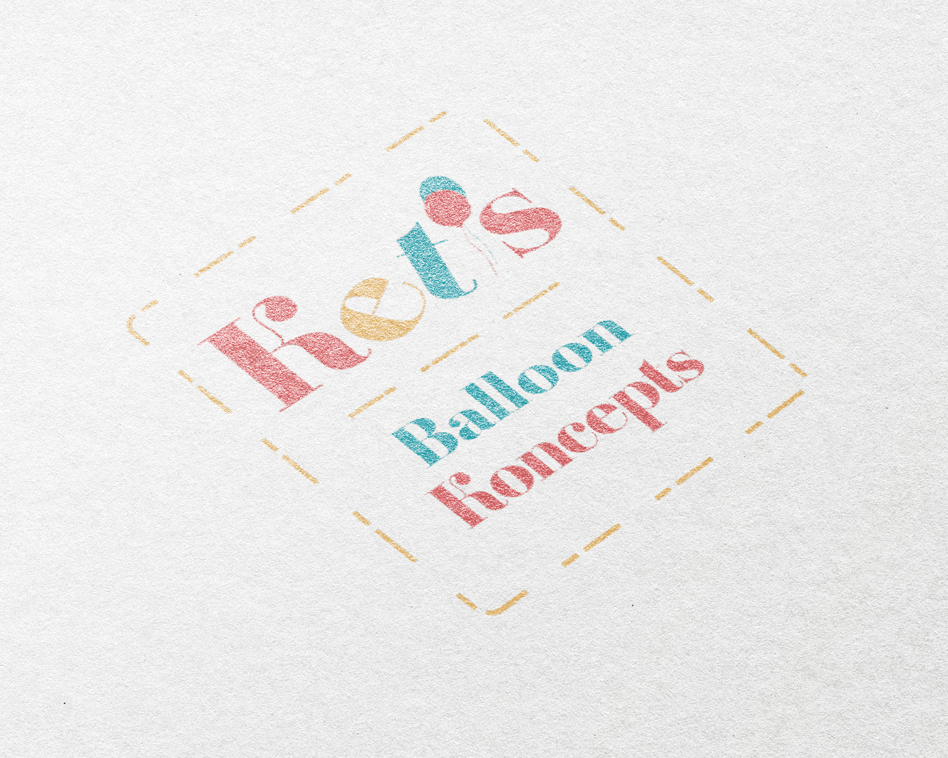
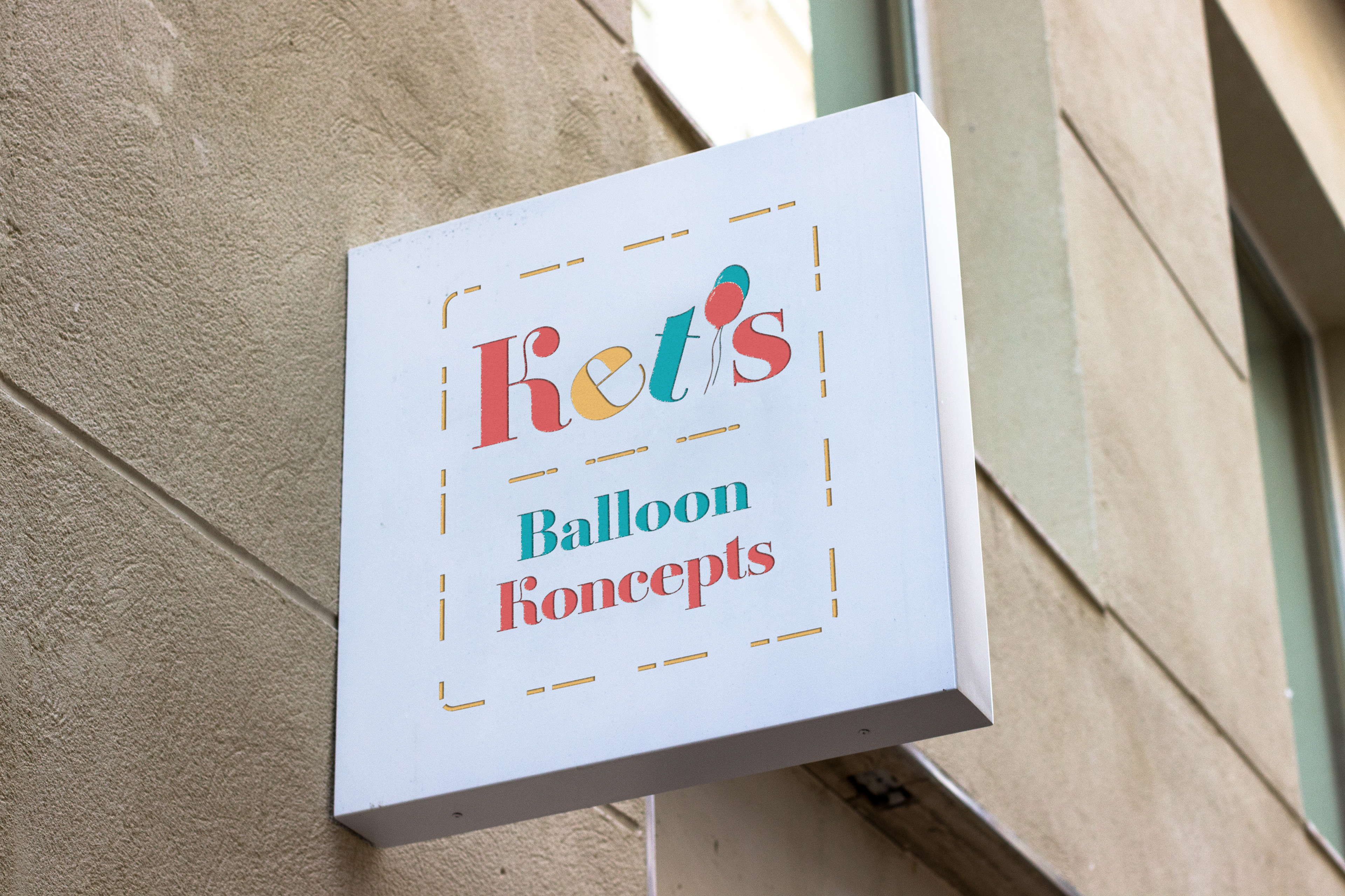
Ket’s Balloon Konceptse, (K.B.K for short) is a company based in London, United Kingdom. K.B.K specialise in creating custom balloons using tailored colour palettes, designed to “Inspire the creativity in you. Whether you have a beer or rosé budget, they still ensure you will have a champagne-popping event.”
A new brand identity for a balloon design company
The aim for this project was to revamp an existing brand identity K.B.K. The Client requested a fresh, new prospective on her branding and the brief I was given indicated the Client wanted a professional, yet approachable brand identity.
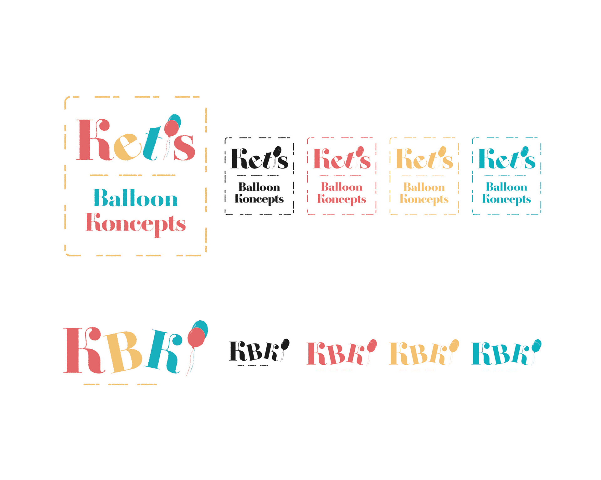
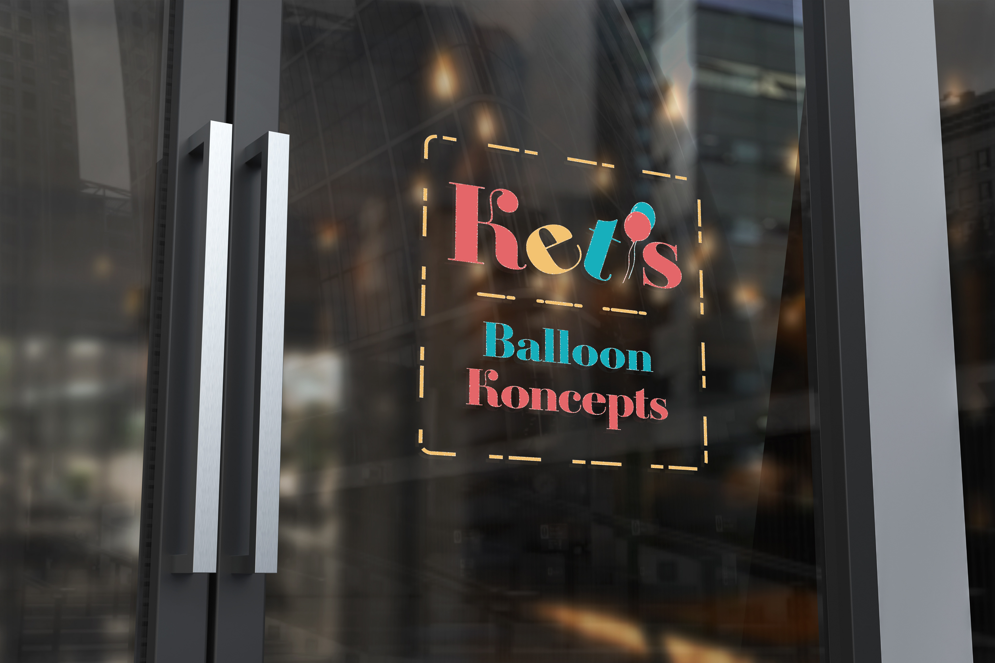
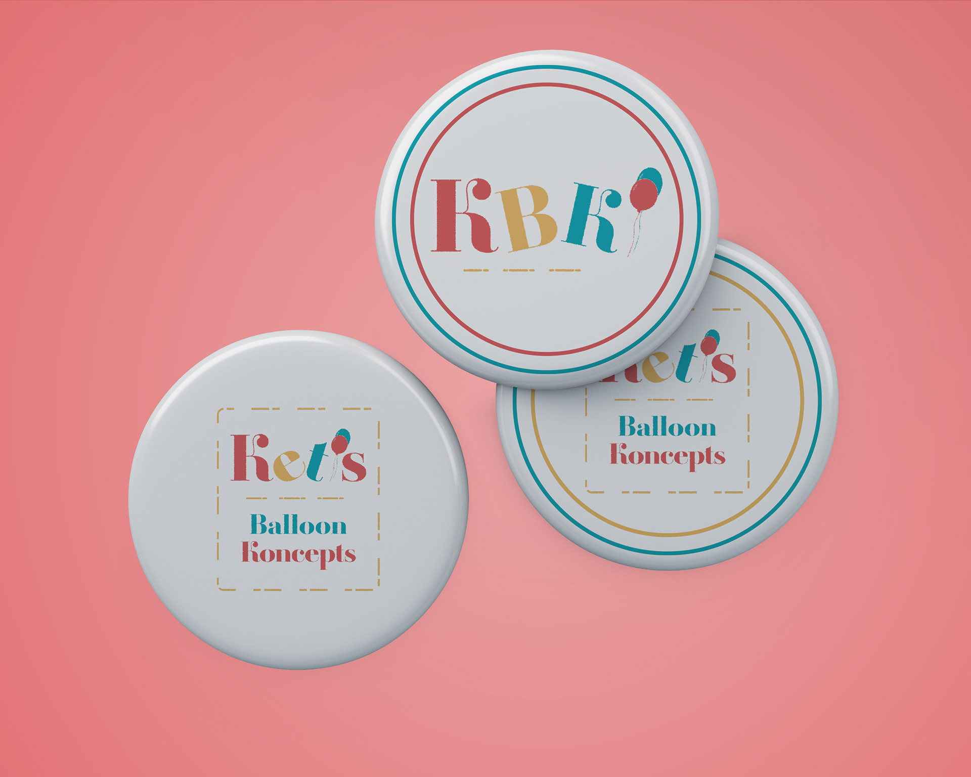
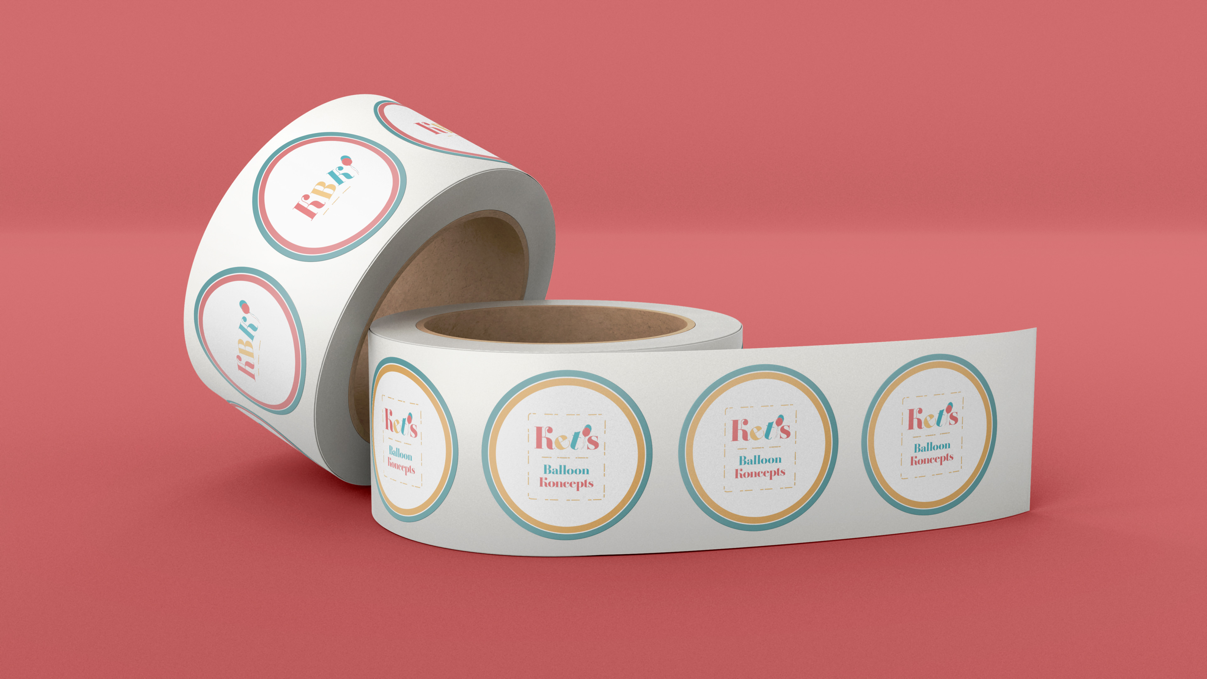
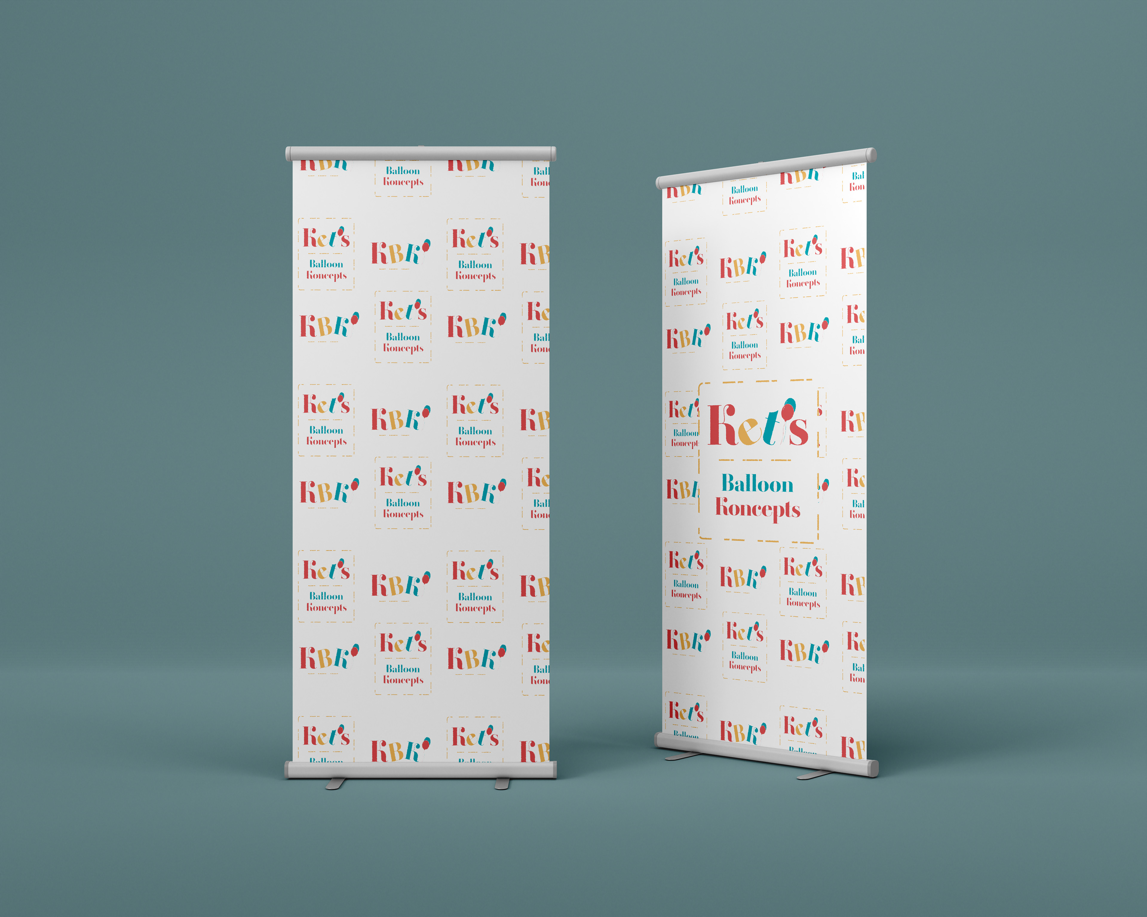
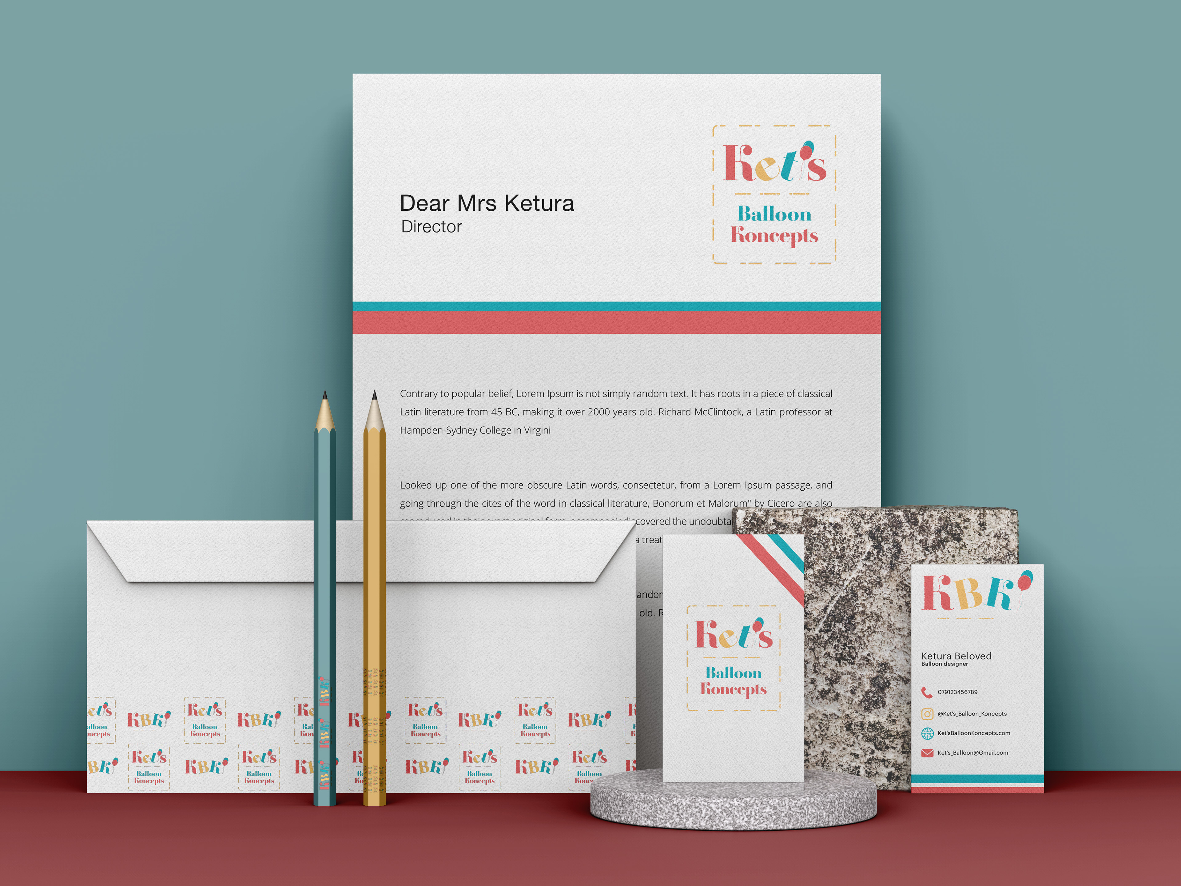
Designing a font logo was a better outcome
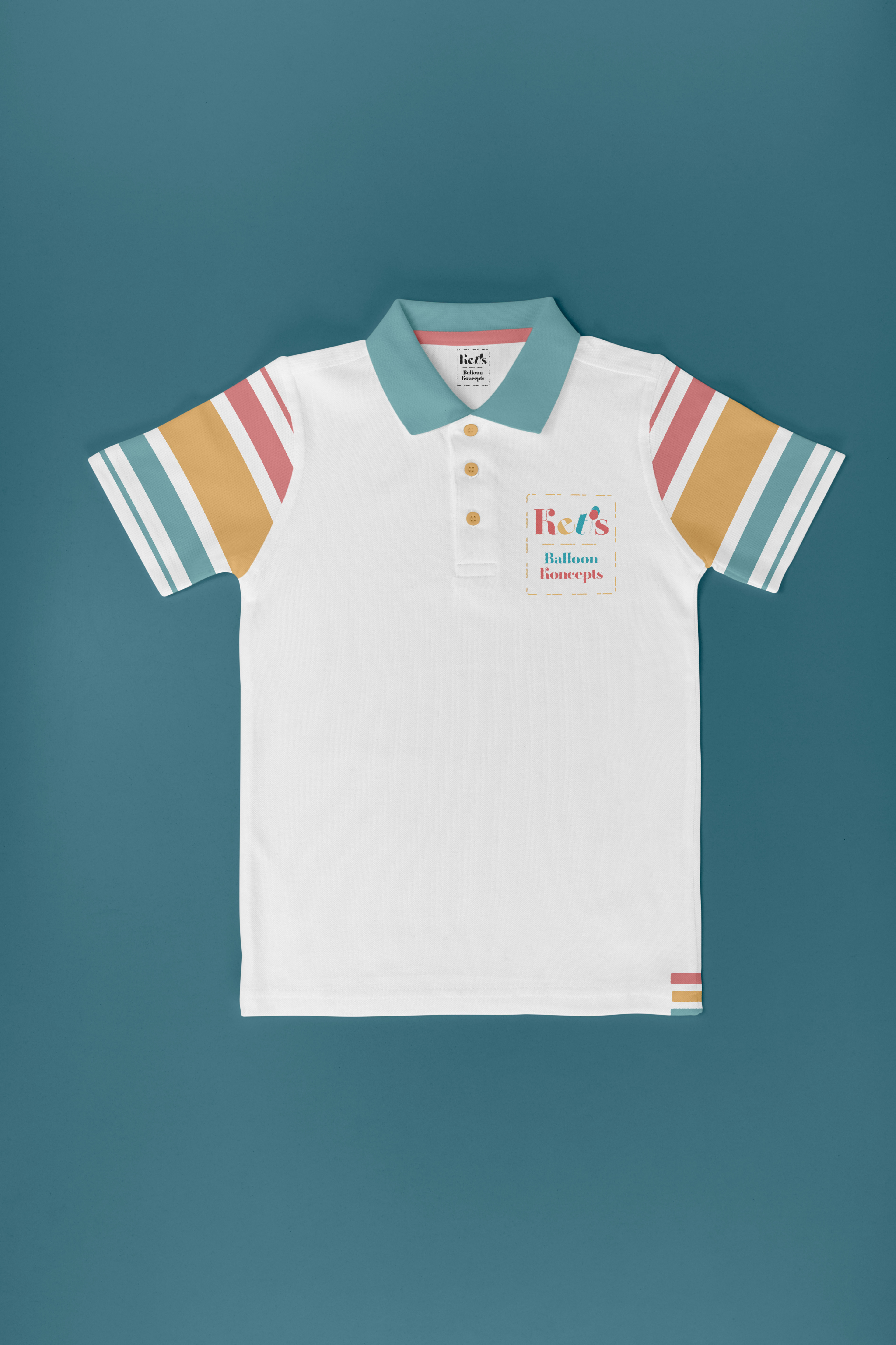
The brand logo is something known as a ‘font logo’, with two balloons acting as the apostrophe, and the misplacement of the letters is to symbolise helium balloons floating upward. The font used for the new brand identity is called Amberoise Std, and the weight of the font is set on Extra Bold. The colour palette for the brand was requested to be in the style of textured pastels, which took inspiration from the shimmer of balloons when they are inflated.
Designing a uniform was important for the new identity of the brand
A Uniform helps to define and distinguish K.B.K so it is easily identifiable. The Uniform also gives the association of pride in their workmanship and creates a good impression to potential clients. An employee wearing a branded uniform also helps to identify those who work for the Company from customers and helps create a more constructive atmosphere.