Brand design Projects
Brand design is the leading subject of graphic design I enjoy doing. Primarily I enjoy solving the challenges for rebranding projects, on this page, I have displayed some original brand designs and rebrand designs.
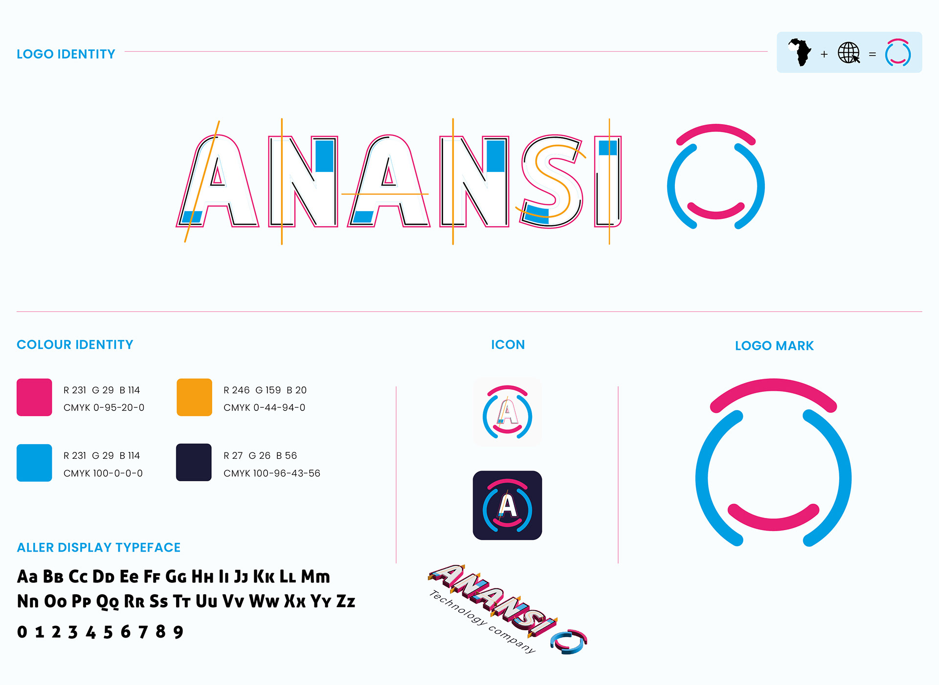
ANANSI
The name “Anansi” originates from West African folklore, a character and the Akan God of Stories, Wisdom, Knowledge, and trickery. He is also, sometimes considered to be the God of all knowledge of stories, and he is commonly depicted in the form of a spider.
Its mission is to be referred to as "the most effective and used search engine in the African diaspora and to become one of the world's most popular brands, by connecting and educating Africans on, artificial intelligence, the advance of technology and its technological advantages, data collection and data distribution.
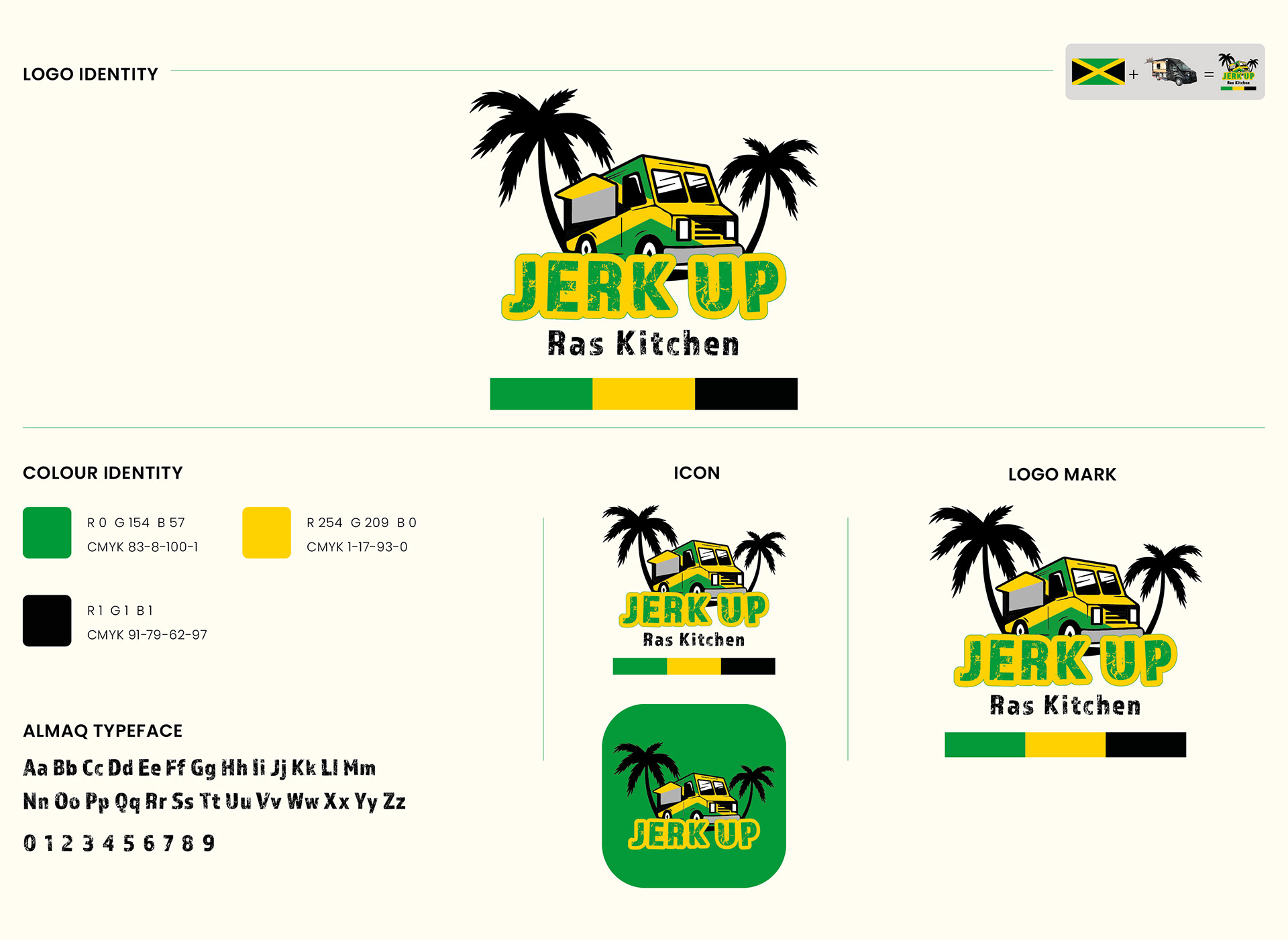
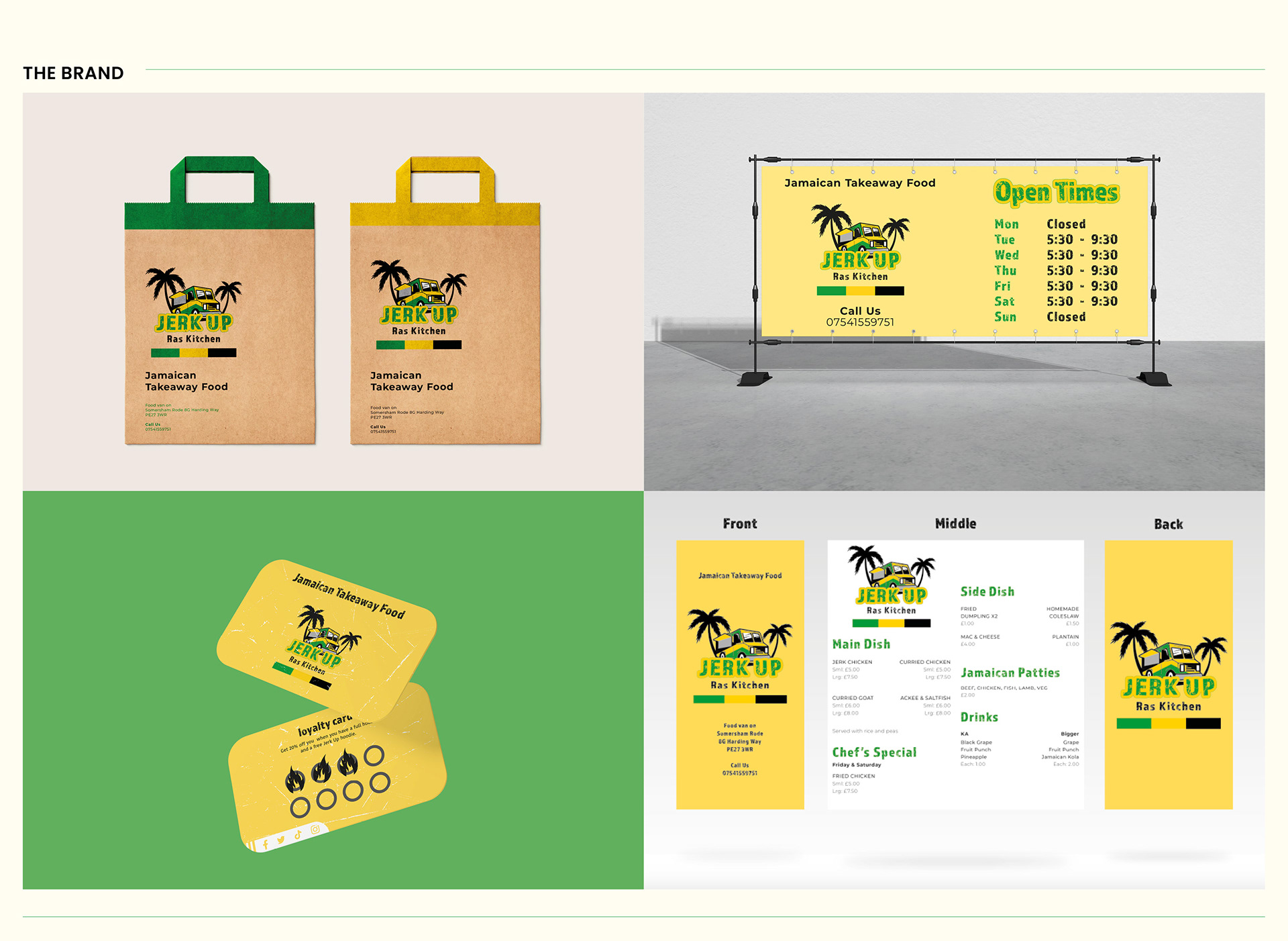
JERK UP
“Jerk Up” is a stable Jamaican food truck based in St Ives, Cambridgeshire, United Kingdom. The owner prides himself on the traditional and well-known Jamaican cuisine he cooks for his customers. The food truck has recently grown in popularity with the local community of St Ives; Due to its welcoming customer service to both new and regular customers.
The aim of the rebranding for the food truck was to create a logo that stands out and shows the welcoming attributes of the food truck’s service. The colours of the Jamaican flag heavily influence the logo.
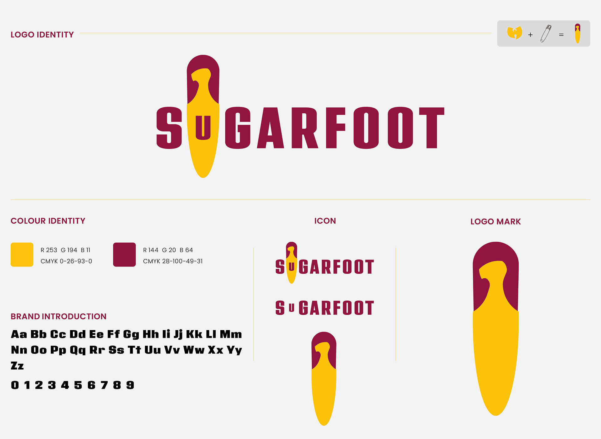
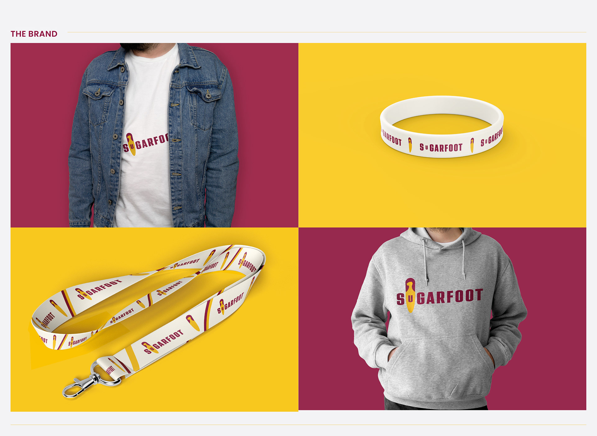
SUGARFOOT
Sugarfoot is a Neo-Soul, hip-hop band based in Cambridge, United Kingdom. The band prides itself on its talented musicians, together they perform both cover and original songs, for audiences, in various music venues in the Cambridgeshire area. The band has recently grown in popularity with its, “Hop Sessions” live music jam, held once a month at, The Grain and Hop Store, in Regent Street Cambridge.
The aim of the rebranding for the band was to create a versatile logo with both the text and icon working together to reinforce the brand of the band. For this, I created a combination logo, which is a logo that combines the symbol and text, which creates a quick-to-recognise design.
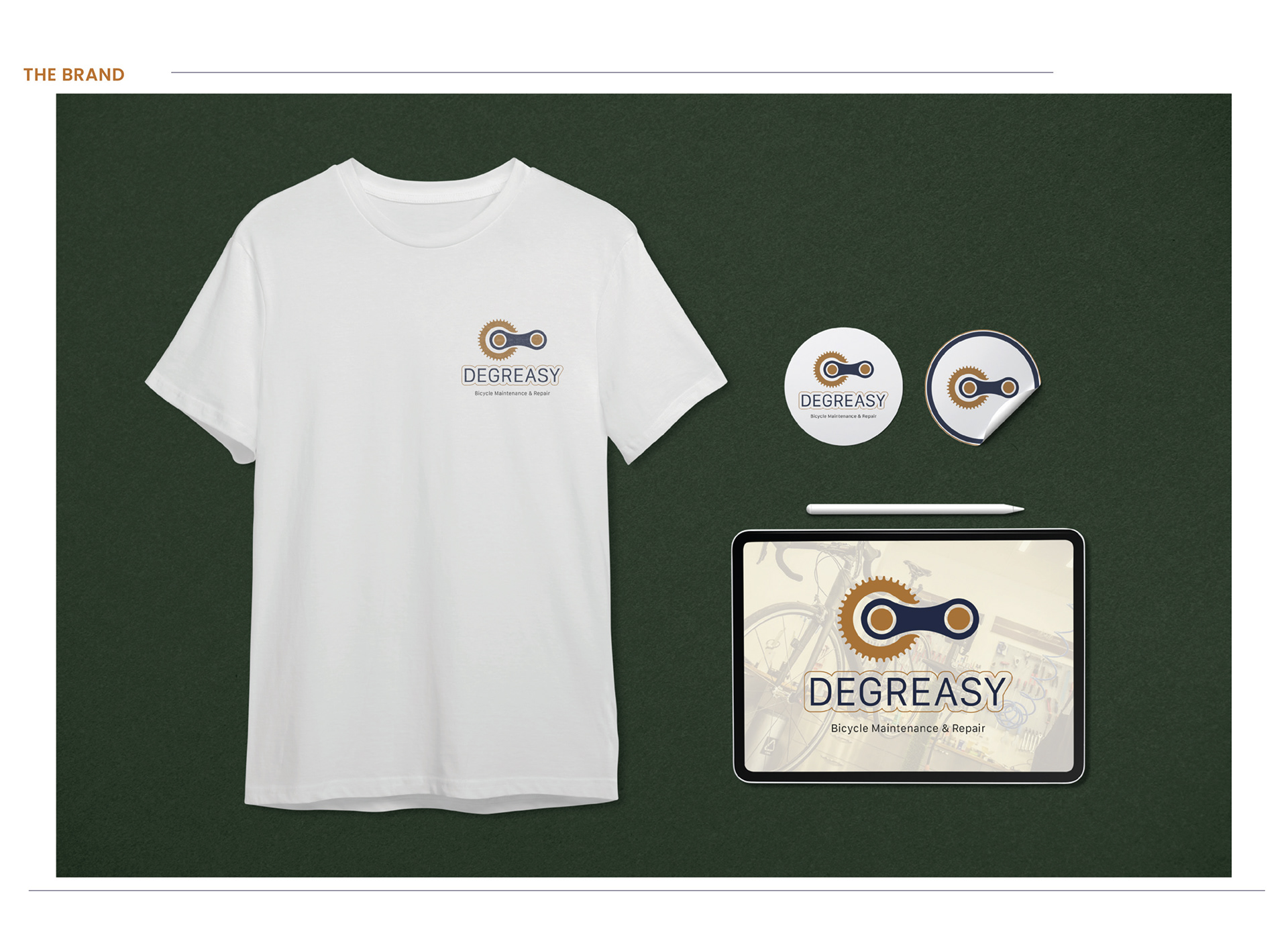
DEGREASY
The design of the brand logo, is influence from two of the most important parts found on a bicycle; The chain link and the chainring. My reasons for using these? two bicycle parts for the brand logo is because they are recognisable parts, and it gives a little curiosity, on what the brand is. The brand logo stands out on its own with the brand colours, and still maintains its shape when in positive and reversed colours, this is something that the client requested.